Visual identity
Academic project
Oct. 2024
Visual Identity
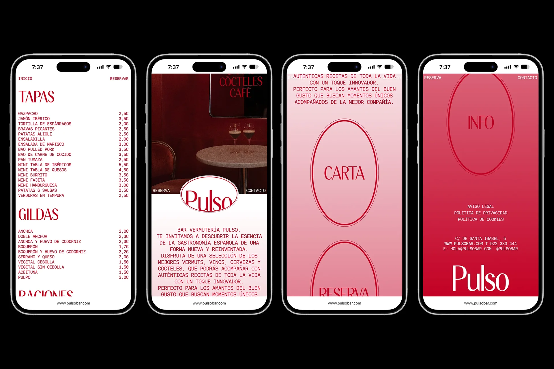
Web design
Art Direction
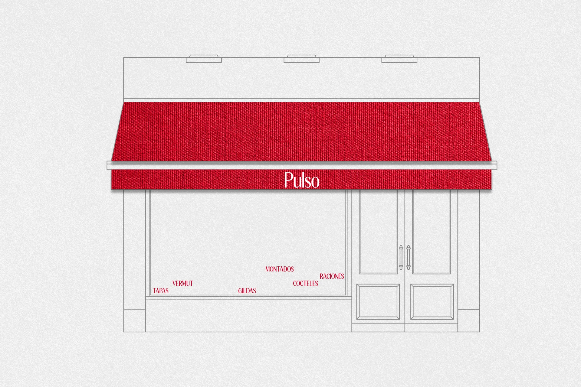
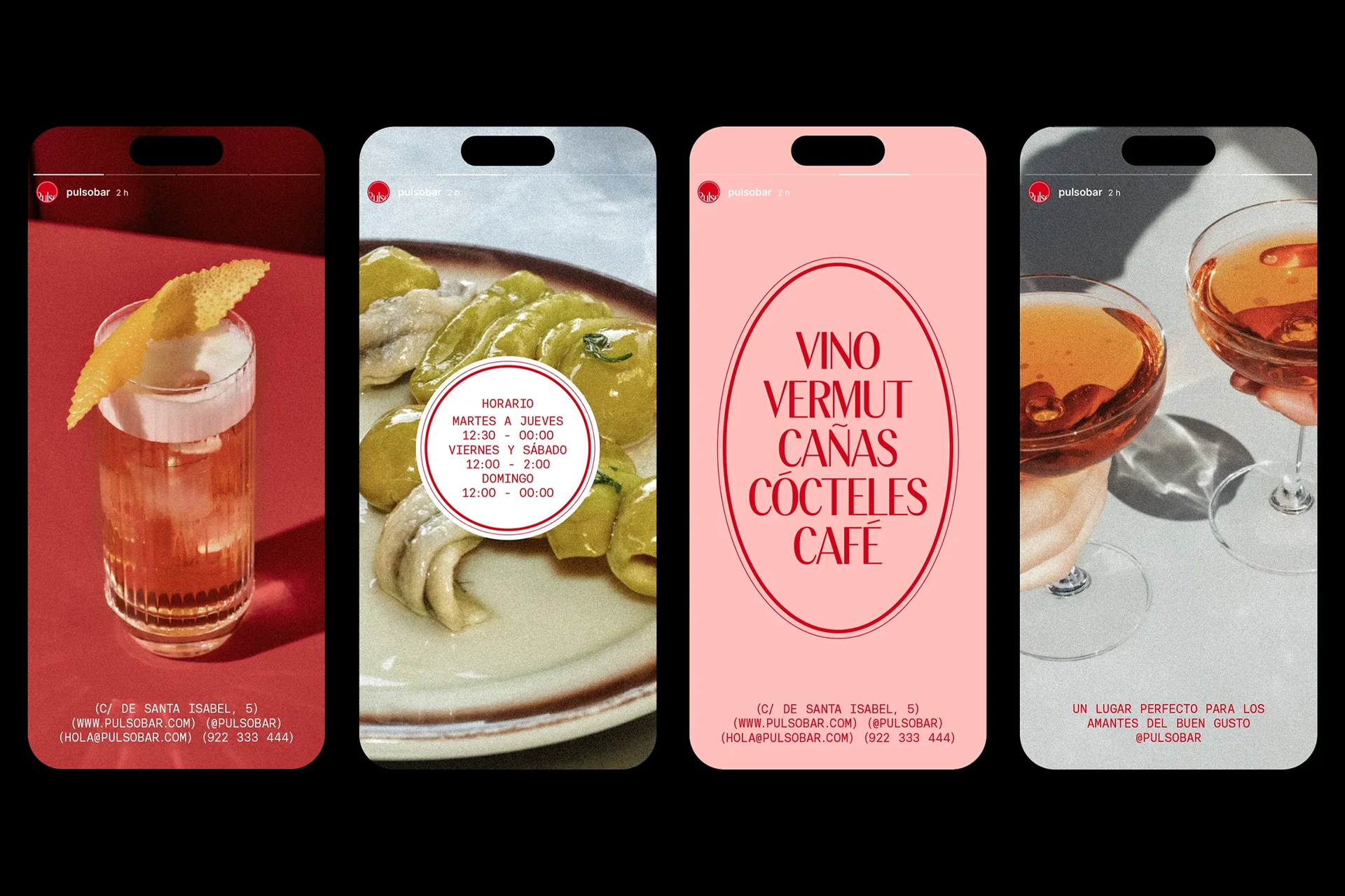
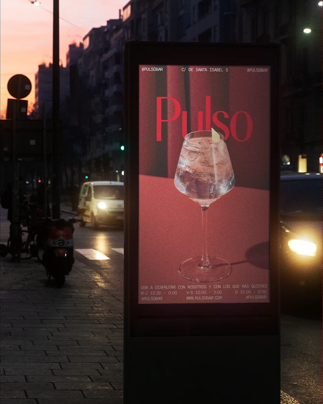
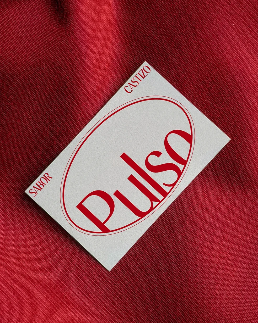
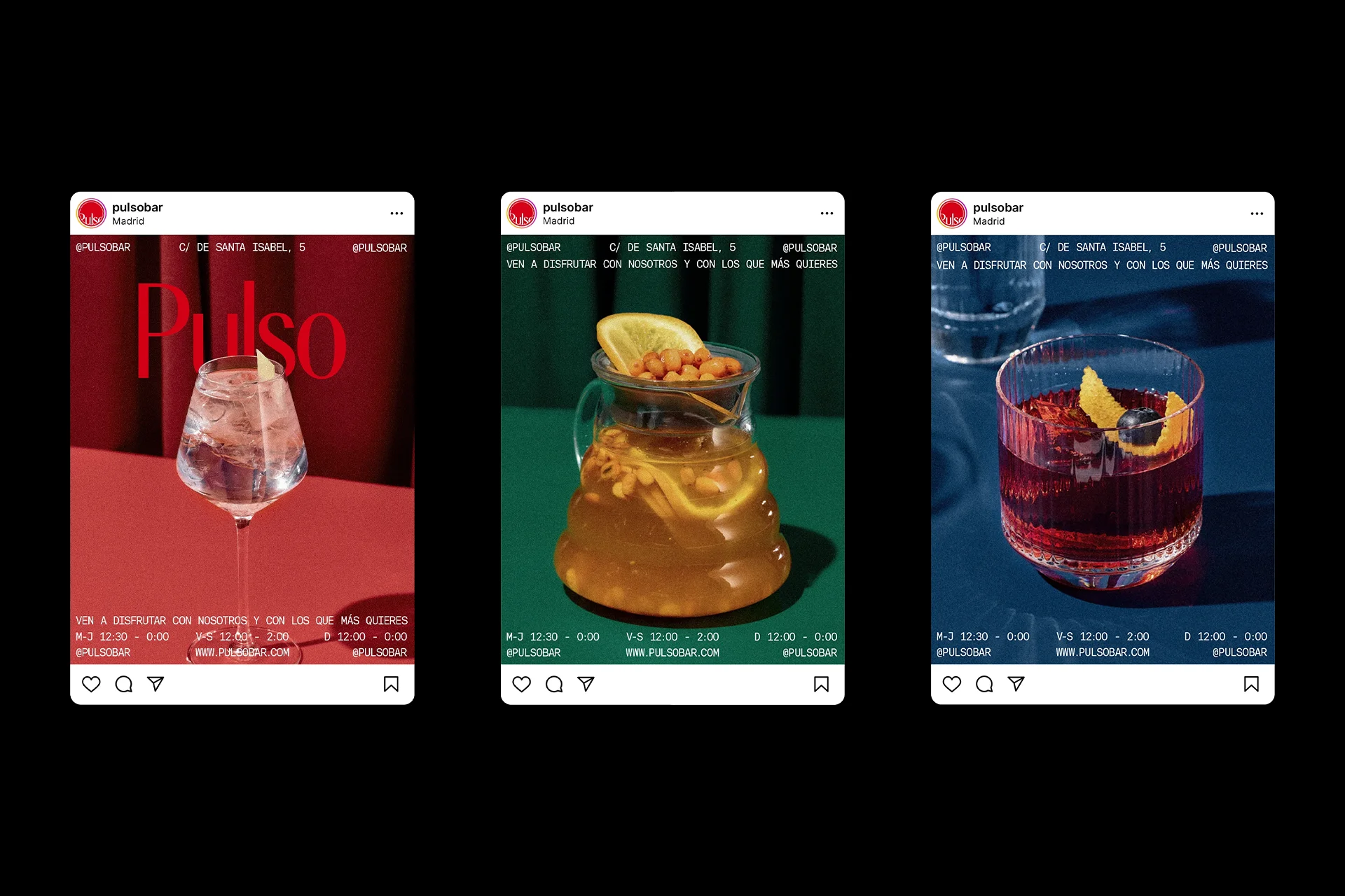
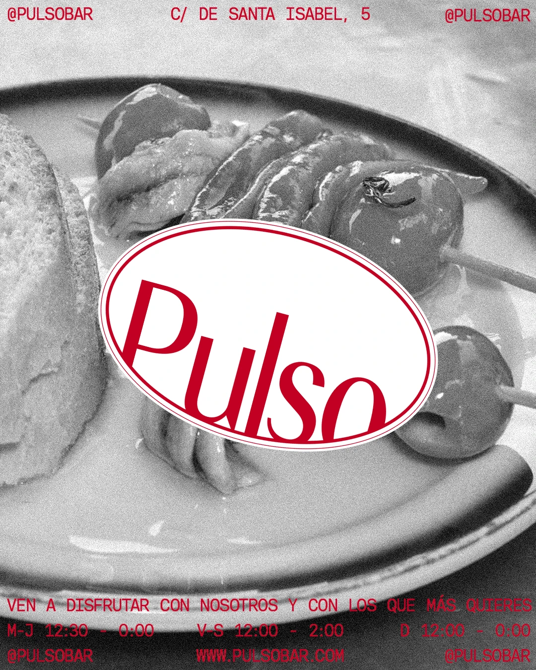
Pulso is a concept for a traditional Spanish bar in Madrid that seeks to update its identity to convey a more modern and sophisticated character, while maintaining the nostalgic essence of traditional Madrid bars.
The main challenge of this academic visual identity project was to refresh Pulso’s image, striking a balance between tradition and modernity with the aim of attracting a wider and younger audience without losing the bar’s familiar and recognisable character. The new design had to communicate the warmth and authenticity of Madrid’s traditional bars, while expressing it through a more contemporary and sophisticated visual identity.
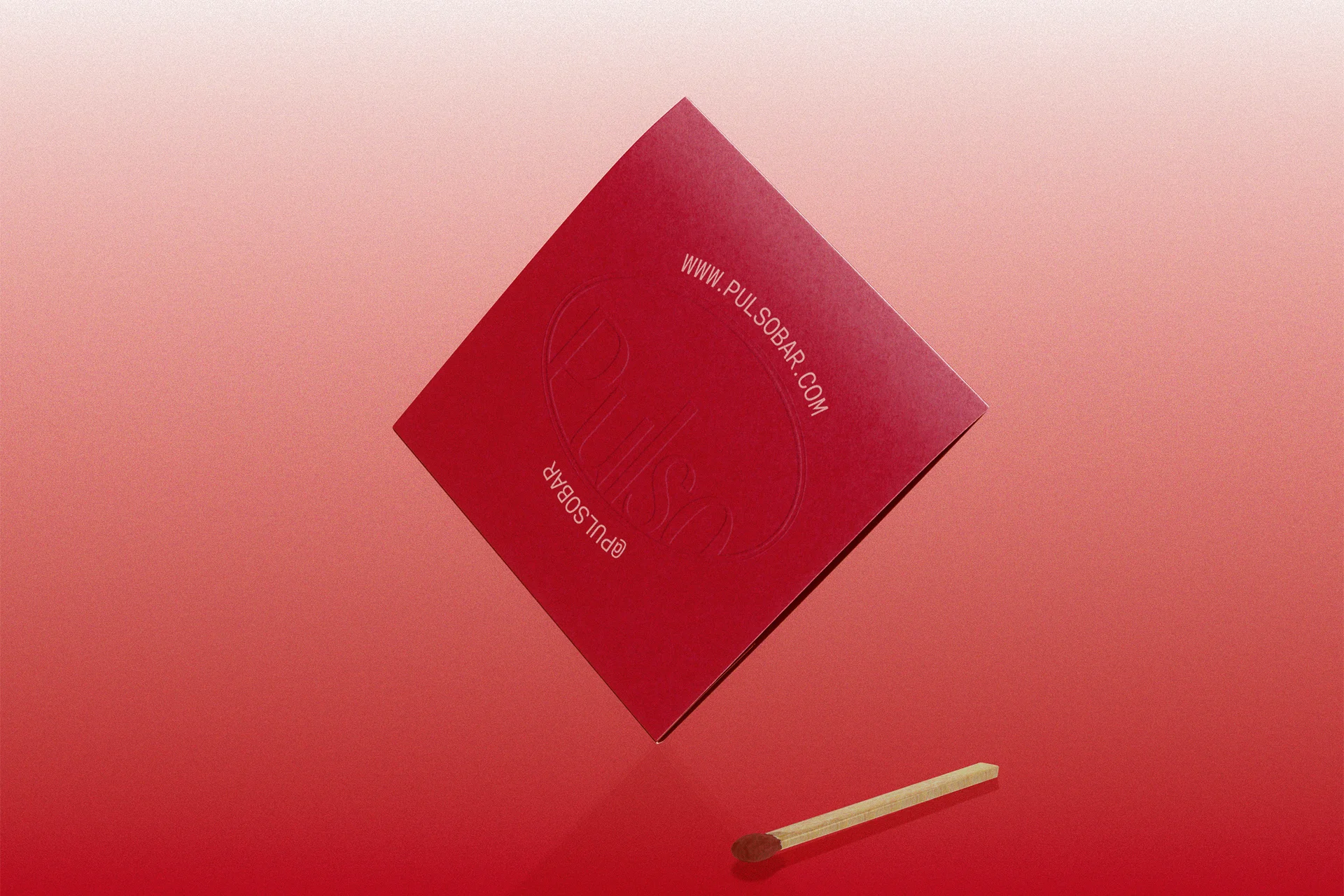
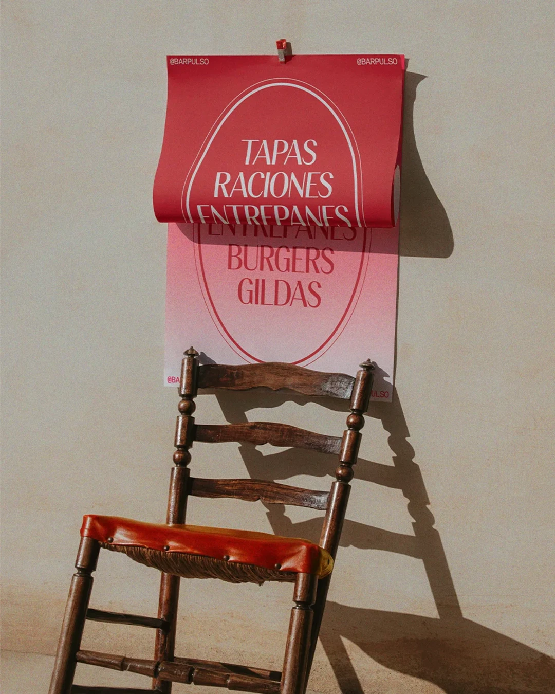
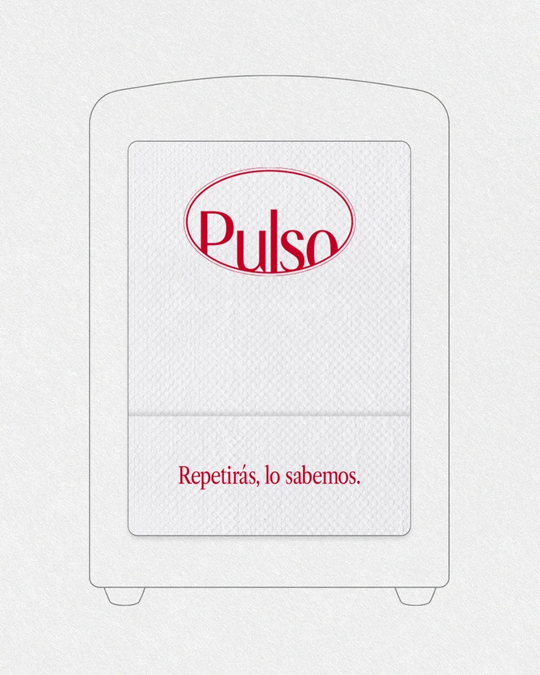
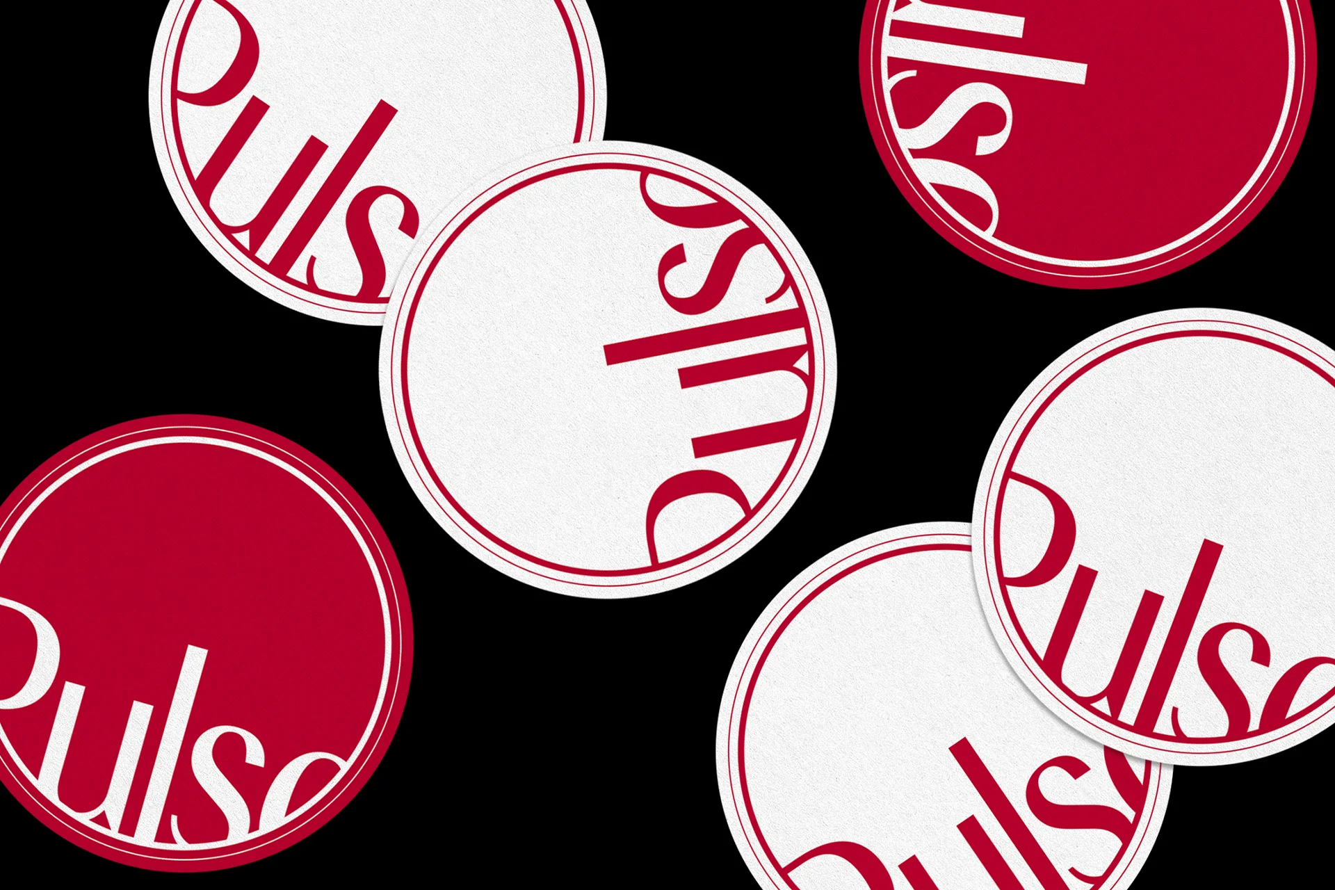
The result is a simple yet solid and versatile visual identity, built around a refined and functional typographic system that plays a central role in bridging tradition and modernity, capable of adapting across different applications while maintaining consistency and reinforcing Pulso’s character.