Javier Collado

COTA Magazine

Editorial design
Academic project
Feb. 2025

What I did

Art Direction
Editorial Design
Visual identity
Logo design

Overview

COTA Magazine is a monthly concept magazine on design, architecture and interior design with a clear focus on aesthetics and their social impact, going beyond just function. The magazine explores various topics such as different types of architecture, the role of women in architecture throughout history or sustainability and it is intended to be a design object in itself, placing equal emphasis on content and physical form, creating a unique and distinctive experience for the reader.

Challenge

COTA Magazine required a design and layout system that was both coherent and visually reflected the quality and focus of its content. The first challenge was to create a timeless and distinctive visual identity, where photography and typography would work in close dialogue, as well as creating a flexible system capable of adapting to different types of content without losing visual consistency, readability and reading rhythm. Another key consideration was the demanding visual expectations of COTA’s target audience.

Outcome

The result is a magazine with a solid, timeless and recognisable visual identity, supported by a solid editorial layout that reflects COTA’s strong character and aesthetic approach, working as a design piece in itself, beyond its informative and communicative purpose.

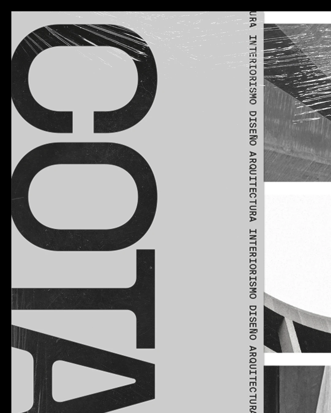
PP Rader typeface used on the logotype and the magazine headers, gives COTA its unique and distinctive character. I chose Helvetica Neue for body texts, contrasting with PP Rader shapes and geometry that have a certain blend of industrial and Art Deco aesthetics. Suisse Int’l Mono is used in secondary texts and small details to introduce a slightly analogue and editorial feel.

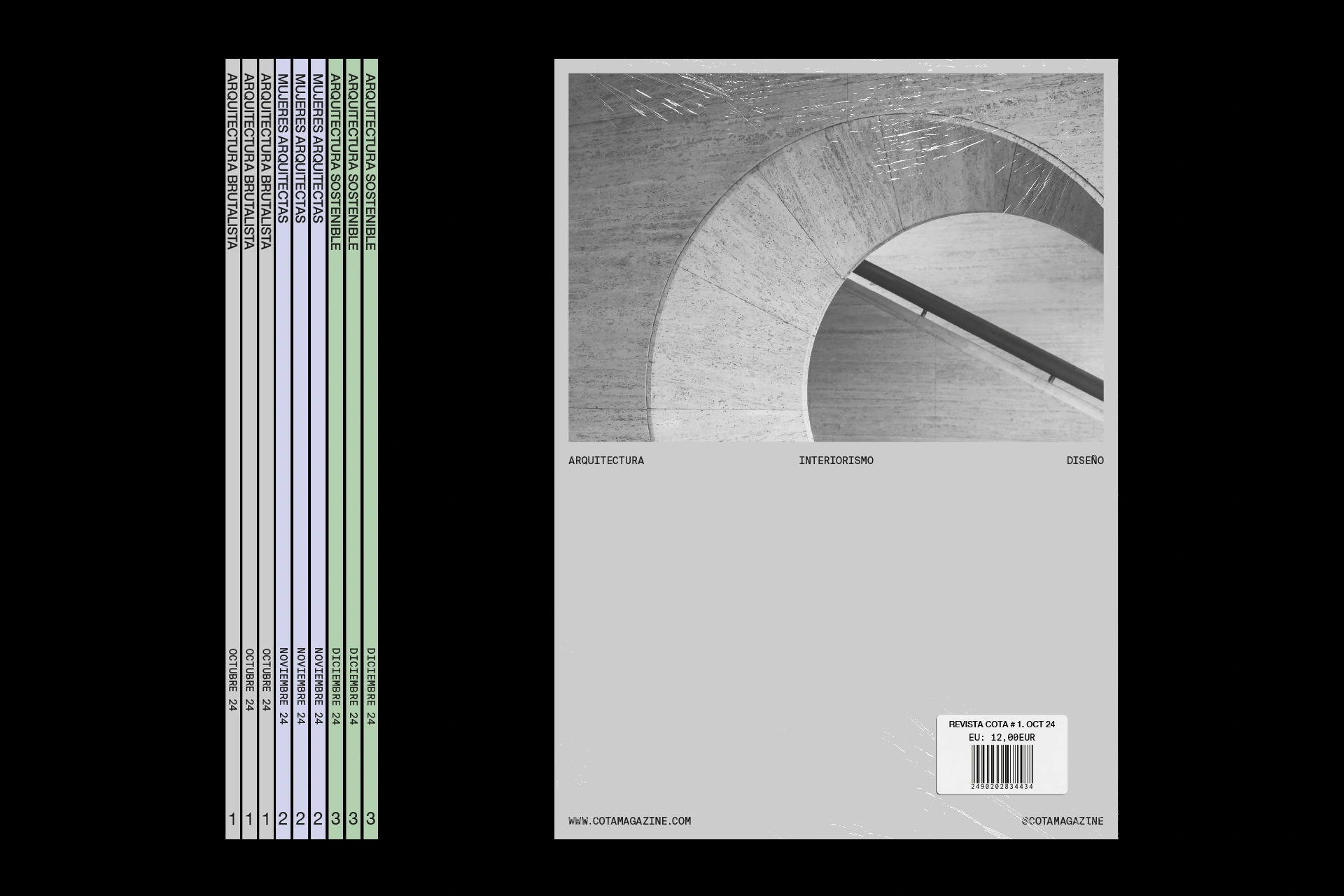
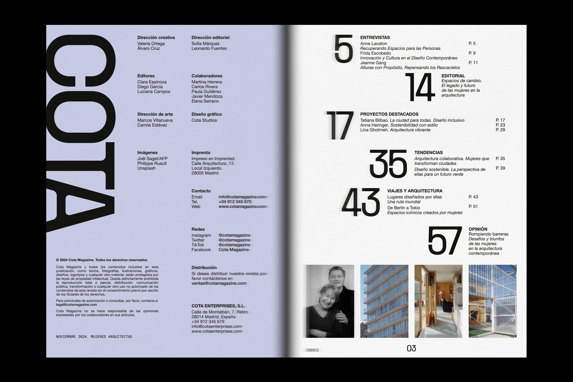
The 8 column and 8 row grid allows the different elements to be arranged in a flexible and dynamic way, while maintaining order and visual consistency throughout the different publications.

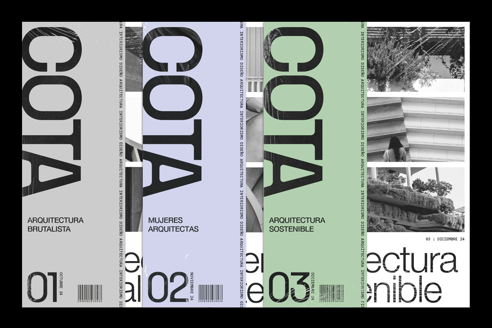
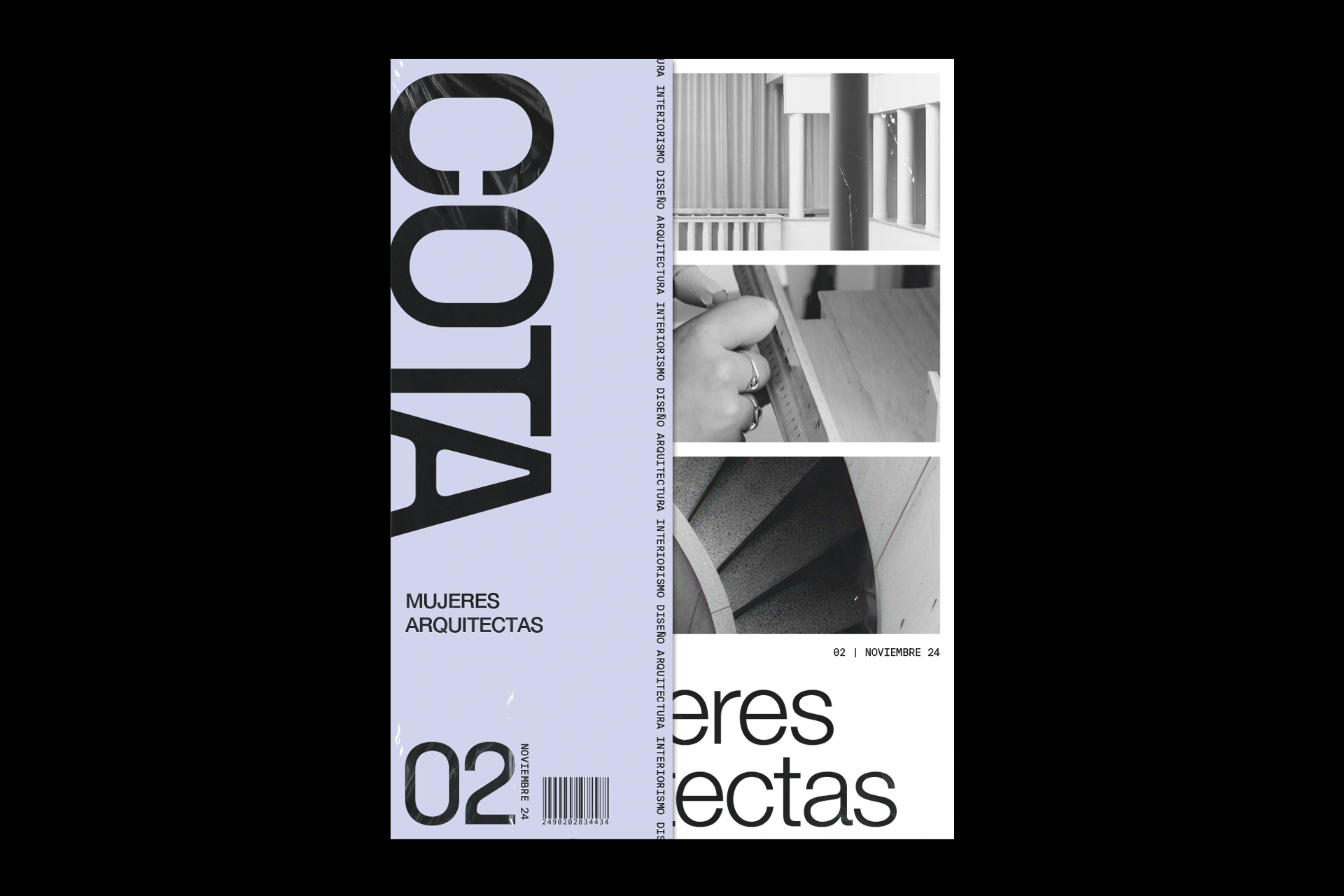
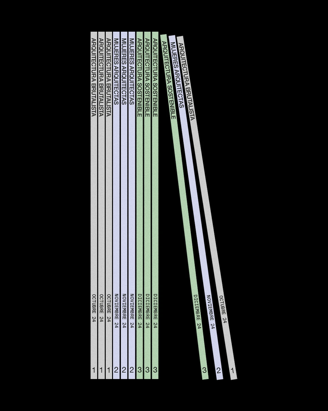
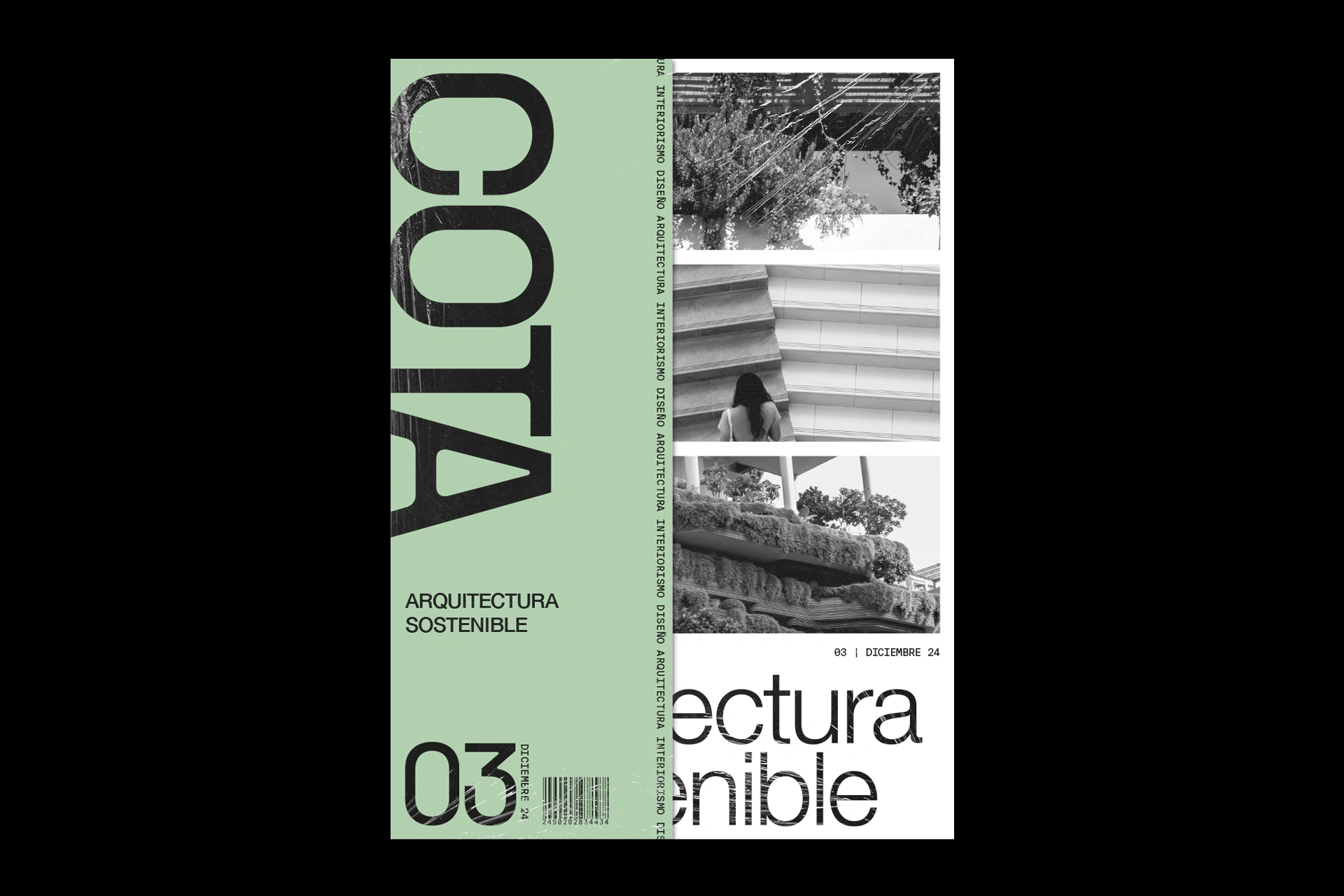
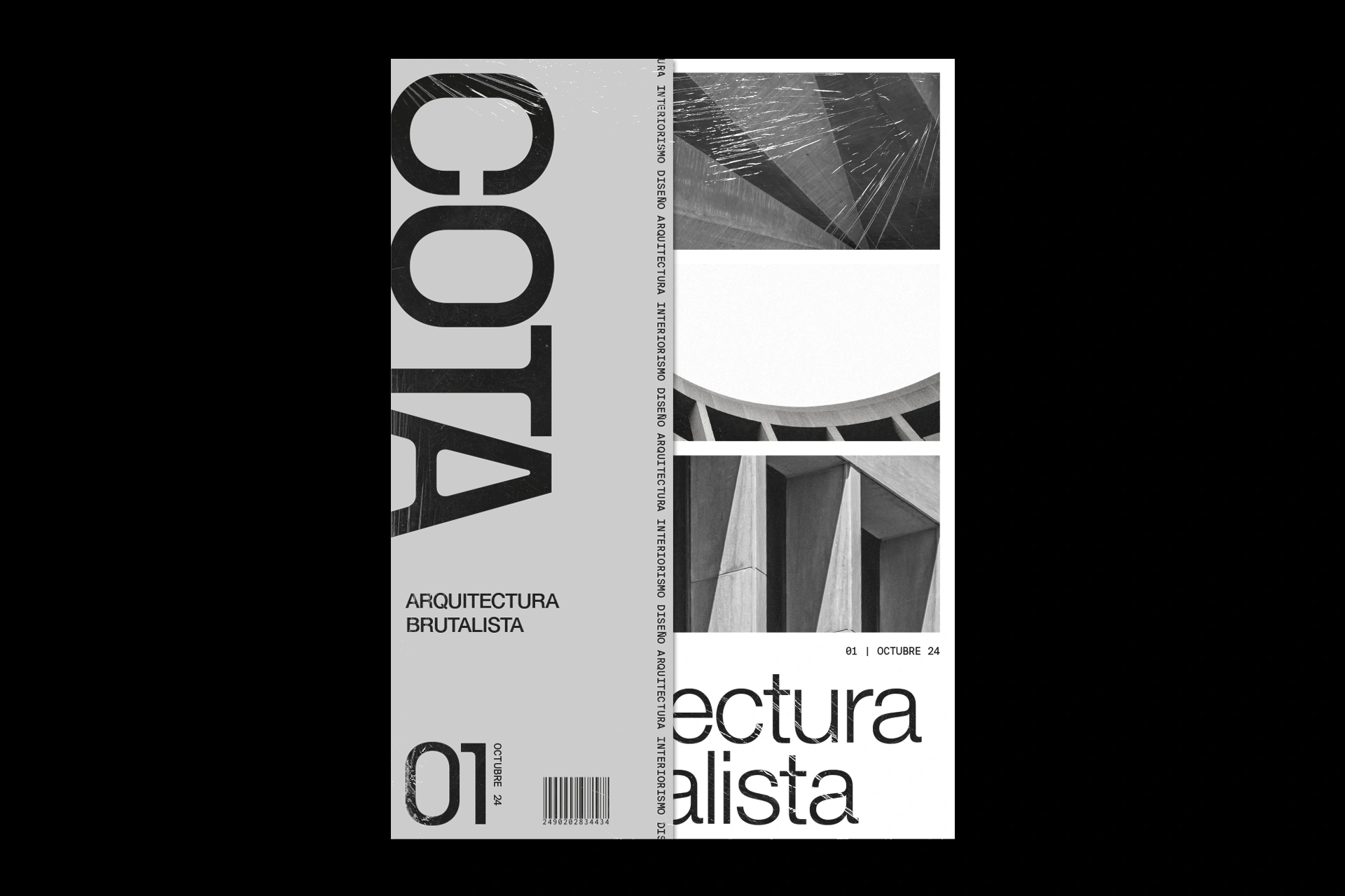
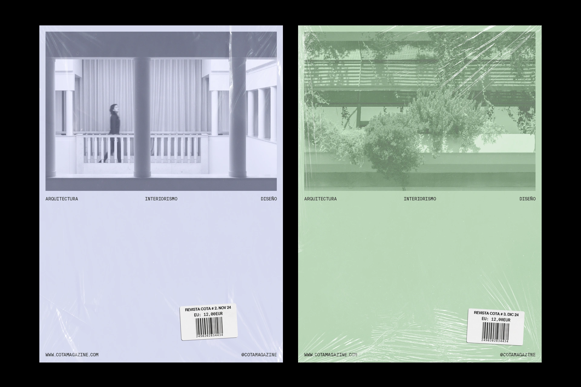
Colour has been used as a differentiating and unifying element across the different issues, primarily through the half-cover. The cover remains in black and white to reinforce the visual impact of typography and images.

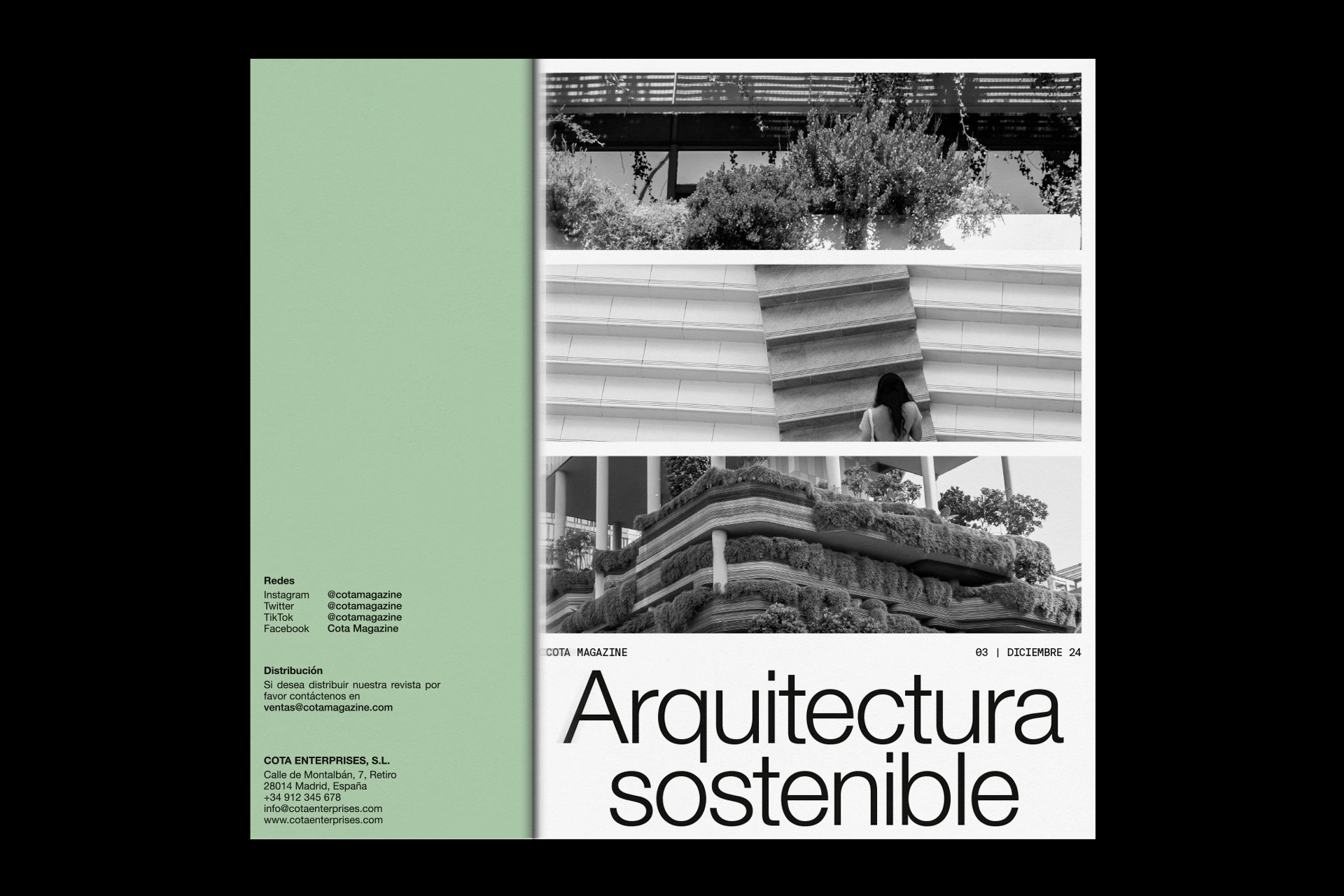
The interior of the publication stands out for its restrained and minimalist aesthetic, using the layout of text and images as a narrative strategy that strengthens COTA’s specialised and technical identity.

The most distinctive feature of COTA is the half-cover, which creates a unique visual effect and introduces an element of surprise for the reader, helping the magazine to stand out from competitors, especially when displayed in shops and newsstands.

error: Content is protected !!