Visual identity
Personal project
Jul. 2024
Visual Identity
Naming
Packaging
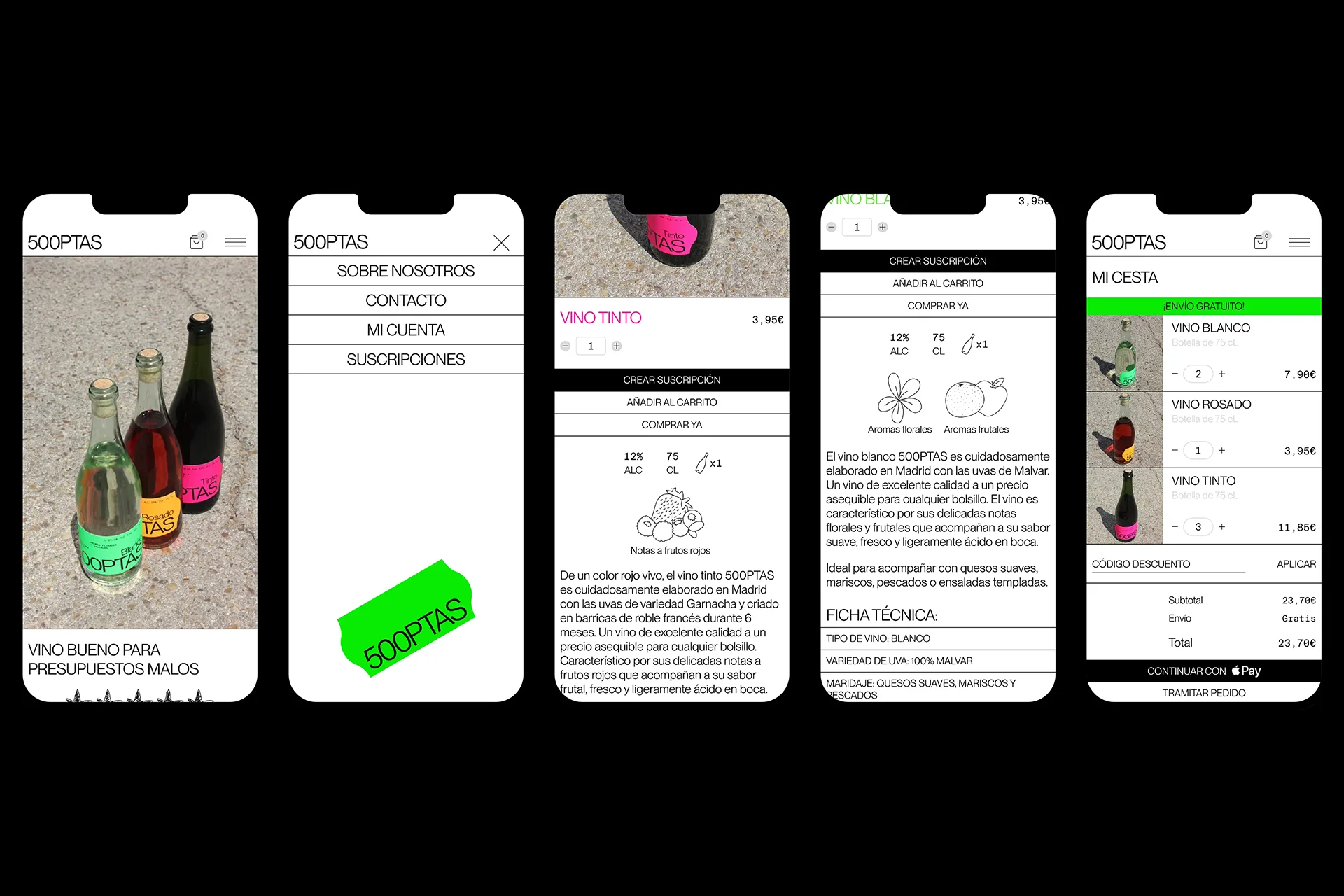
Web design
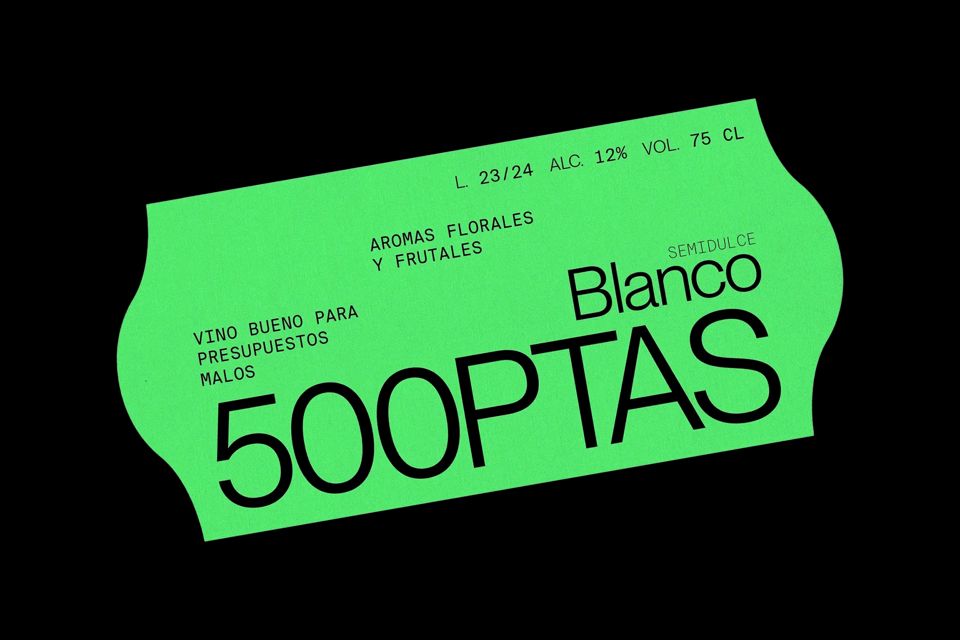
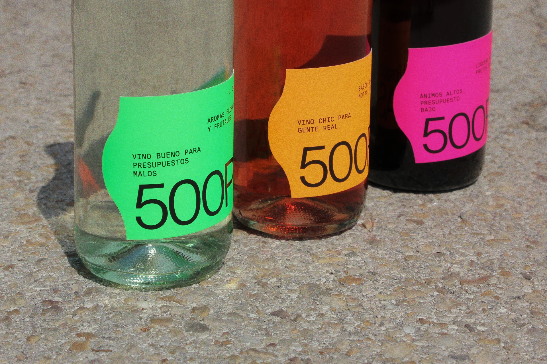
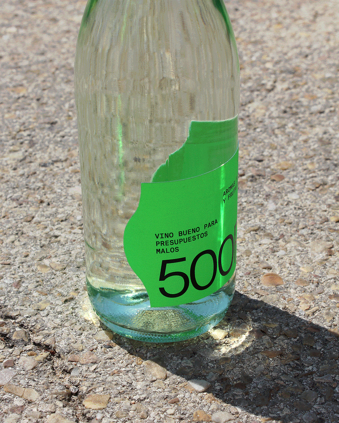
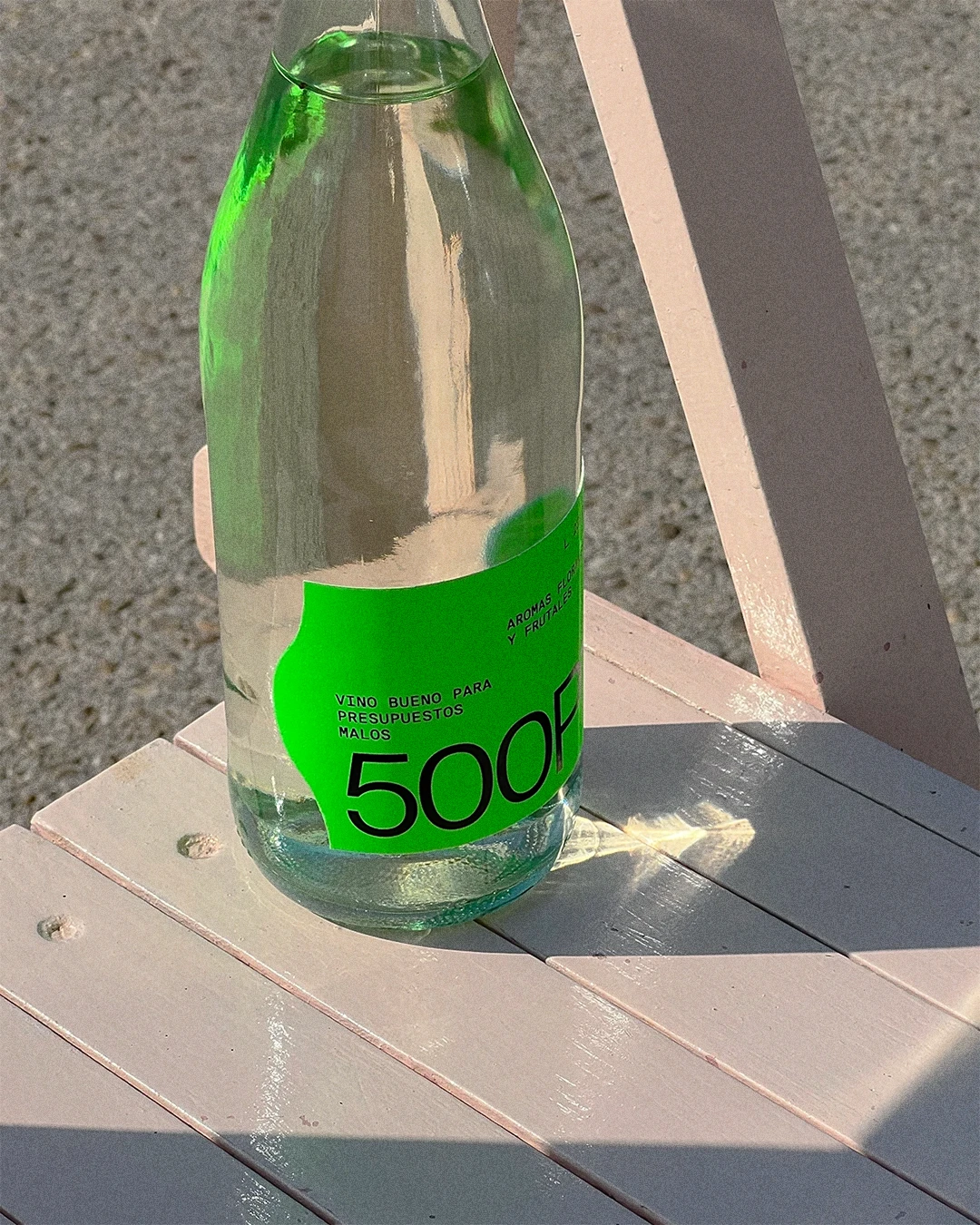
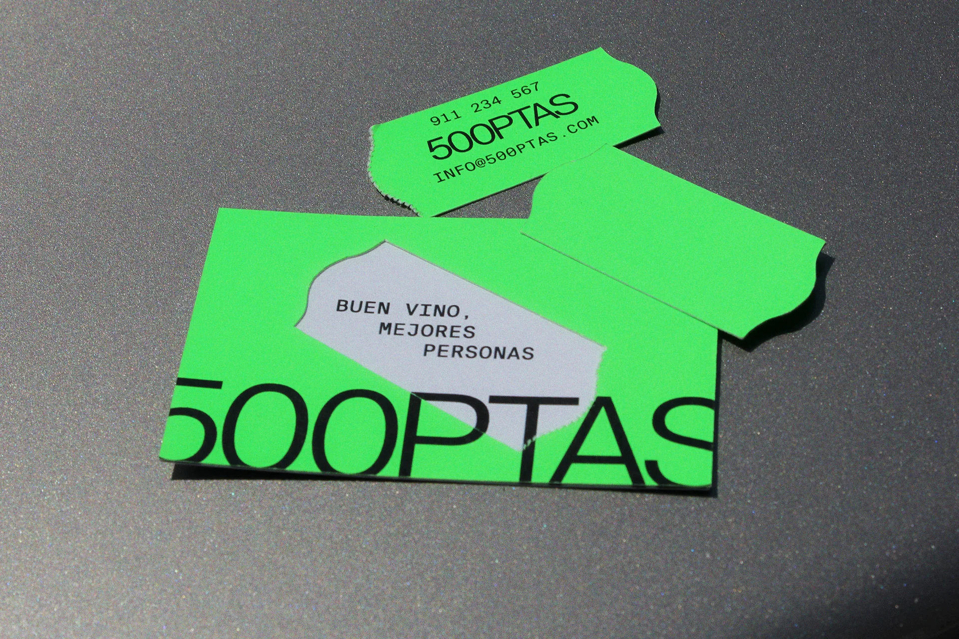
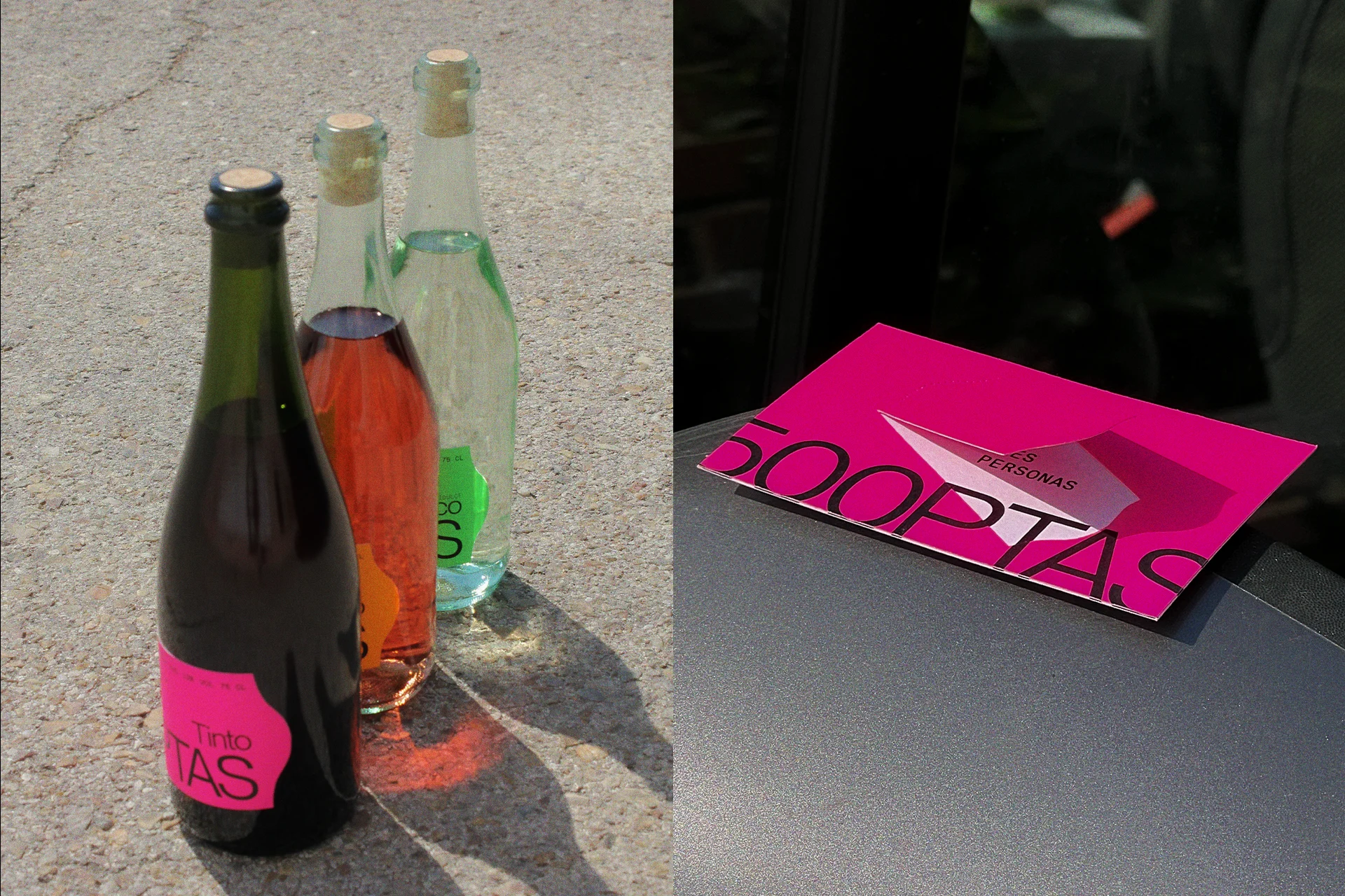
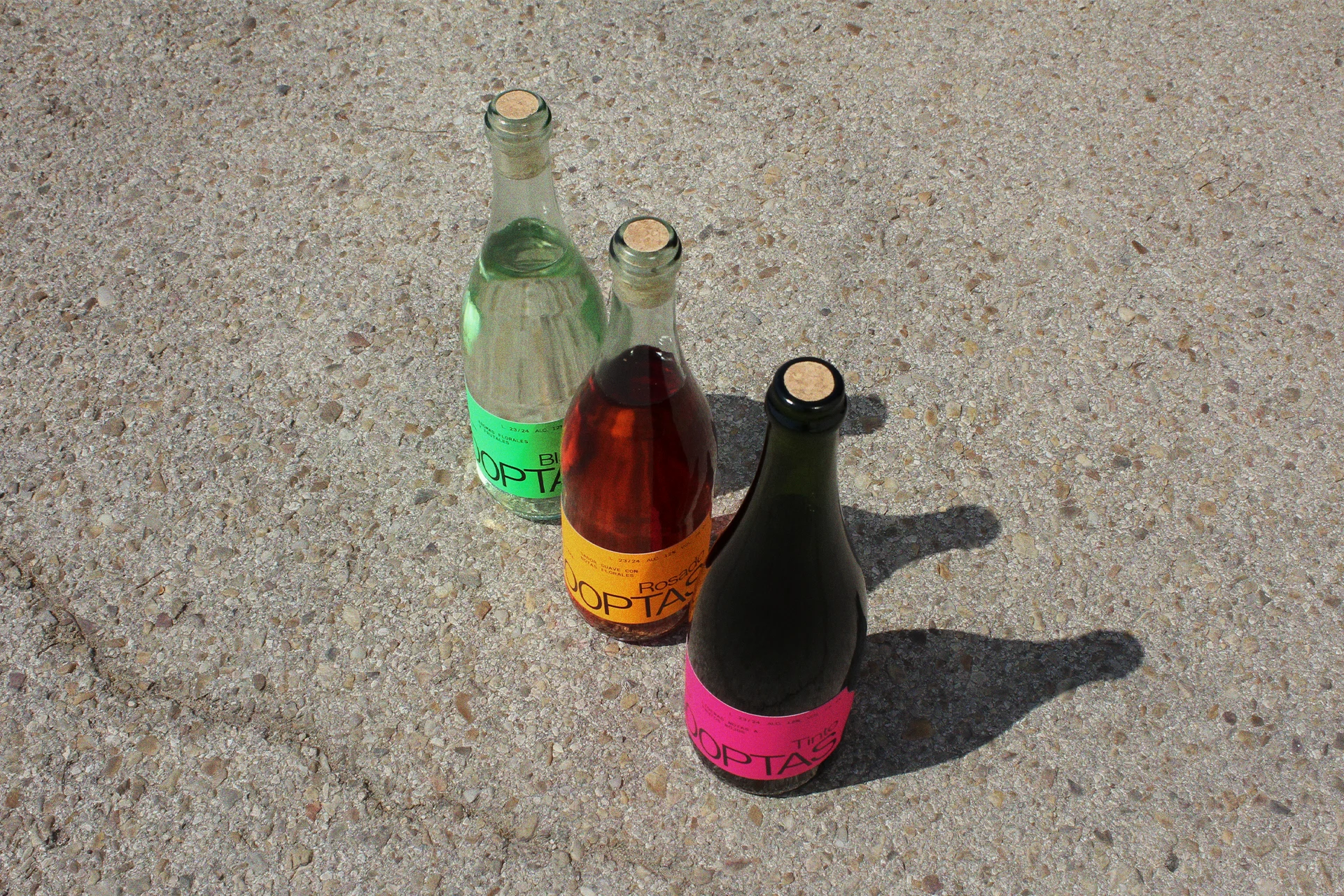
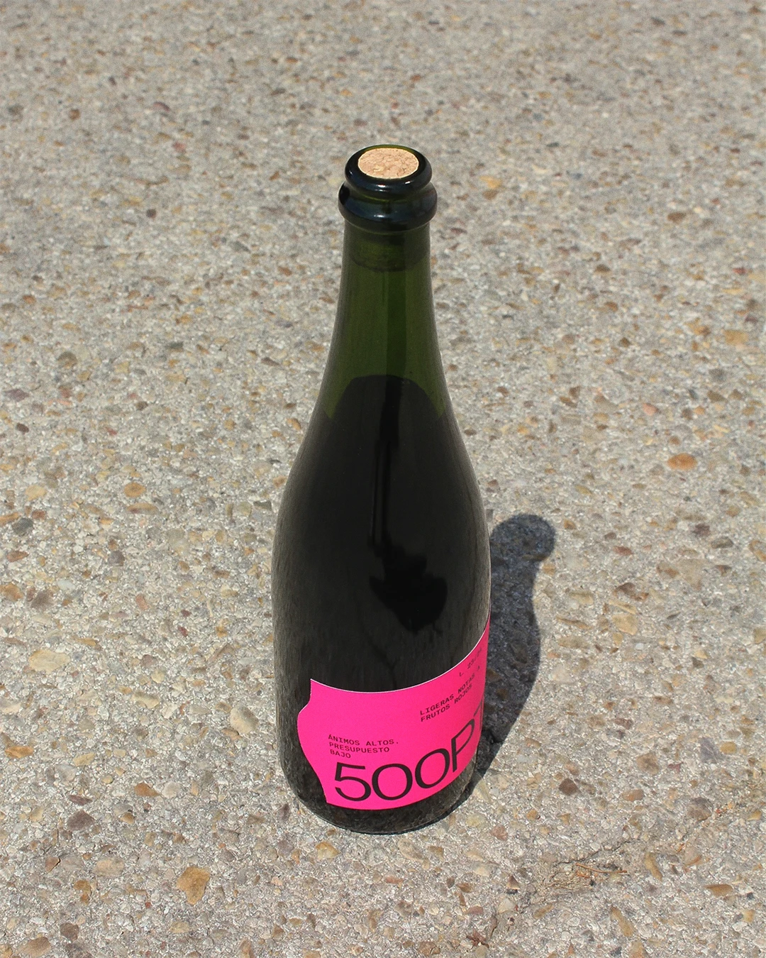
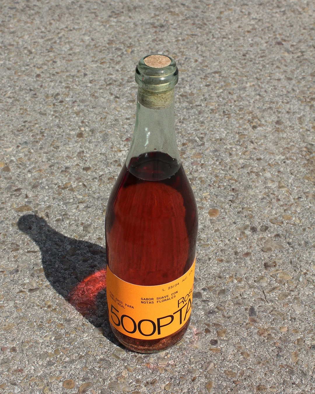
500PTAS is a tribute to local shops and traditional bazaars, specifically inspired by the small orange price tags commonly placed on products. This fictional personal project reinterprets these labels, making them the main element of the visual identity for an affordable yet sophisticated wine brand that combines tradition and modernity.
The main challenge of the project was to redesign these modest price tags and turn them into a distinctive and recognisable feature of the identity, capable of connecting with the collective memory of people who have, at some point, encountered such labels.
The result is a simple visual identity and labelling with a strong symbolic value and character that reflects the tradition and authenticity of these small local businesses. The identity works both in digital and physical media, and the bottle labels, intentionally arranged in an irregular way, introduce a sense of spontaneity and differentiation allowing the product to stand out from the competition.